|
Interview with Rick Chappell a.k.a. "SoundChaser" (6-25-05)
Ever since I started burning my own CDR's, I've tried to add cover art to them, first just using Microsoft Word with inserted images from the web and finally getting a copy of Photoshop to do my own artwork. And I'm not alone - there are A LOT of people that have questions about making their own personal CD covers for their CDR's, bootlegs, mixes, etc.
So I jumped at the chance to interview Rick, not only asking about how he got involved with Jerry Boyd's projects, but also asking questions for the novice designer such as myself.
E.C.: I understand that you are not a "professional designer", correct? Is your "regular job" something in graphics? SoundChaser: I'm actually an engineering technician in electronics. Though, I've always been an artist at heart. When I was in my teens, I wanted to design album covers for a living. I was totally obsessed with album covers (I even bought a few albums just for the cover). I was a huge fan of Roger Dean, who did the artwork for most of the YES albums. I took art classes all through school until I got into college. I was leaning towards a career as a commercial artist at that time but then decided to pursue something more technical instead. I still wanted to be creative but in a more mathematically structured, less freeform way. I also have a side business developing Palm software, which has been a great creative outlet. Shameless plug: my software site is at www.palmettologic.com E.C.: Are you a musician? SoundChaser: Only in my head. I played trumpet and dabbled in guitar for a little while, but I just didn't have the chops for it. That was frustrating for me since I have close relatives who are talented musicians. I do love music more than I think most people do. I listen to recorded music almost constantly and I go see live bands every chance I get. I also spent 13 years working for the engineering division of a company that manufactures guitar amps, speakers, and related electronics (Ampeg and Crate products). Most of my co-workers at the time were musicians - some extremely talented. It was a great experience just being involved in the music industry and rubbing elbows with rock stars now and then. I miss that. E.C.: How did you end up doing the covers for Jerry Boyd and his LIFE OF BRIAN series? SoundChaser: I found Jerry's LOB series while researching rare Beach Boys material. I thought it was really exceptional work. I was also inspired by the cover art Jerry had on his site. I really liked the idea of recreating those classic album covers. I pulled the old albums out of my vinyl collection and started recreating the front and back covers from scratch. I thought the artwork Jerry already had was very well done but I wanted to add some more detail and, where possible, bring them a little closer to the original BB covers. Eventually, I completed the whole package for each of discs 1-4 (front & inner panels, tray cards, liner notes, and disc labels). By then, Jerry had his SURFCLOWN SMiLE disc available. I sent him an email requesting a copy and attached some samples of my LOB artwork. I also offered my design services in exchange for copies of some of his other projects and he accepted. Along with the stack of discs that I requested, he sent me an early copy of The BEACH BOYS SMiLE AGAIN and we were soon exchanging ideas for the cover design. I enjoy working with Jerry since he has a somewhat more creative imagination than I do when it comes to conceptual ideas, so he basically provided the creative spark for the artwork (and the musical inspiration) and I just took it from there. E.C.: I was really blown away by your "re-design" of all the previous LIFE OF BRIAN covers, plus your new artwork for THE BEACH BOYS SMiLE AGAIN. What other CD covers or music-related graphics have you done? Is this something you would want to do more of? Or is it simply a hobby? SoundChaser: I have a new web gallery available at http://www.palmettologic.com/gallery_home.html where more of my cover art can be viewed. Most of it is Beach Boys & Brian Wilson related. I have a substantial list of new BB & BW fan mixes planned, so I'll be doing new covers for those and posting them in the gallery as they become available. I'm also working on some YES outtake compilations that I'll be creating new artwork for at some point in the future. This is really just a hobby, but I wouldn't mind doing more of it. If any of your readers would like me to do some custom artwork, they should feel free to contact me. I will say that I can't work for free but I do work cheap (I might even consider bartering an exchange of services). CD COVER DESIGN & GRAPHICS QUESTIONS:
E.C.: What format do you use? (I'm going to assume you use Photoshop and my questions will be related to that format...) SoundChaser: I use Photoshop Elements. It's much more affordable than Photoshop and has all the essential tools. E.C.: What image "size" do you use for a "template" in designing covers? SoundChaser: For the standard CD jewel case, the front cover is 4.75" x 4.75" (or 9.5"W x 4.75"H for folder-style inserts). The back tray insert is 4.625"H x 5.906"W, including .25" on the left and right sides for the spines (so the width of the actual tray image would be 5.406"). Disc labels are 4.5" diameter with a 1.6" diameter center hole. Templates in several different formats can be downloaded from http://www.cdcovers.cc/cover_templates.php (the download links are at the bottom of the page). E.C.: What about pixels and how important is their "size" in the design? SoundChaser: Contrary to what they say, size does matter. The normal resolution for low-end printing is 150 dpi (dots per inch or pixels per inch), and for high-end, professional quality photographs the resolution should be 300 dpi or higher. The most common resolution for computer monitors is 72 dpi, so this is fine for use on the web, but not so good for printing. If you change a 72 dpi image to a higher resolution, you won't increase the image quality. The information was already saved at 72 dpi and the computer can't add more information to improve the quality. Conversely, if you change a 300 dpi image to a lower resolution (say, 72 dpi), you lose all those extra pixels of information, which decreases the quality of the image. This is why it's important to set the proper canvas size and resolution before you start working. I typically use a resolution of 200 dpi for my CD art (or 300 dpi if photos are involved). Obviously, the higher the resolution, the larger the file size. If I have a finished graphic that I want to post on the web or email to someone, I'll save it as a medium-quality JPEG to reduce the file size. E.C.: When I first started doing covers for myself, I really didn't know what size to use and sometimes ended up shrinking the image-which resulted in a kind of "blurring" effect. How do you avoid this blurring? SoundChaser: When you shrink an image with a fixed resolution (or dots per inch), you're effectively attempting to cram more dots into each given inch. This results in a loss of information, hence less detail. The key is to start with the correct size 'canvas'. This avoids the need for shrinking or stretching. When copying and pasting an image on the canvas, always try to copy an image that's equal in size or just a little larger than you need and then adjust it to the desired size. If needed, Photoshop's "sharpen" filter can help compensate for this blurring effect, as long as the size hasn't changed too drastically. E.C.: Also, if I happen to have lettering on the image and shrink it, it also gets blurred or fuzzy. Is lettering something you do absolutely last? SoundChaser: Lettering is something I usually do early in the process, though it's always subject to change as the project progresses. The key here is using layers. Keep the lettering on its own text layer. Photoshop does a good job of anti-aliasing text (anti-aliasing refers to smoothing or blending the edges). As long as it's kept as a text layer, Photoshop will readjust the anti-aliasing each time the text is resized. Once you 'simplify' the layer or merge it with another layer, you can no longer scale the text with satisfactory results. Keeping it as a separate layer also allows you to play around with different fonts, colors, and other effects at any time. E.C.: Are there any "settings" that must be in place first to insure a clear, final product? SoundChaser: Start with the correct size canvas and increase the resolution. Photoshop Elements defaults to 72 dpi for new files. I recommend a minimum of 150 dpi. E.C.: I have some images that I created years ago when I first got Photoshop. Some of these I would like to revisit and improve. How do you approach a "re-design" job? How do you go about making the pictures and lettering "crisper"? SoundChaser: When reworking older images, I usually feel that my Photoshop skills have improved since creating the original design. So, I generally get better results by recreating it from scratch rather than trying to "fix" the original image. If there are any parts of the image that I don't need to improve on, they can be copied and pasted to the new image. This is much easier to do if the original image was saved with all the separate layers intact. E.C.: When I have an image that I want to use and it is only available as a gif file (or a bmp for that matter) - is this the right procedure (this is how I do it): Create a template jpg file with the right settings-then copy clip the image from the gif and insert it in the template? SoundChaser: Correct. That's exactly the way I do it. E.C.: Here's the scenario: I'm assembling images to be brought together for a 'final' image. There are all various sizes. Any tips on how to handle a large image that has to be shrunk down to fit with the others? How do I (effectively) shrink the image without losing quality? Is this in the dpi settings? SoundChaser: Here is how I would do it...
E.C.: Finally, any tips for the novice CD cover designer (such as myself!)? SoundChaser: Here are a few basic tips that come to mind...
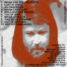
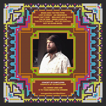
Here's an example of SoundChaser's work on LiFE OF BriAN:
EAR CANDY:
|
 Intro: